Rebrand / Website
From a WordPress template to a staffing company with a face of its own
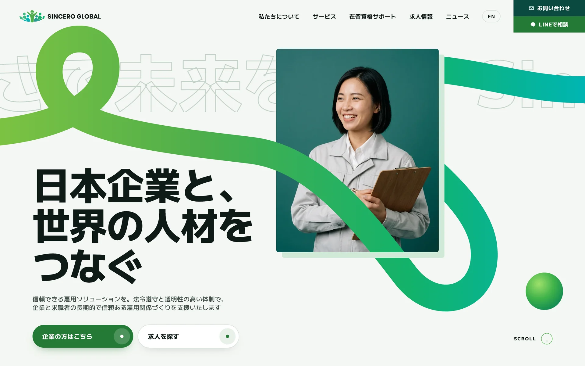
Sincero Global connects foreign residents in Japan with Japanese companies. Its site was a WordPress template of stock photos, pale blue boxes and text laid over pictures. We rebuilt the company’s look around its green logo and put Japanese and English on one domain: sinceroglobal.jp.
- 2 → 1Domains for Japanese and Englishsinceroglobal.jp
- 0 → 4Tags search engines and AI readdescription, Open Graph, hreflang, JSON-LD
- 4 daysFrom approved design to live on its own domainSep 25 to 29, 2026
- en-US → jaDeclared language of the Japanese pagehtml lang
Where it started
A company licensed by the Ministry of Health, Labour and Welfare for staffing and placement, with visa support on top. Solid underneath. The site said the opposite.
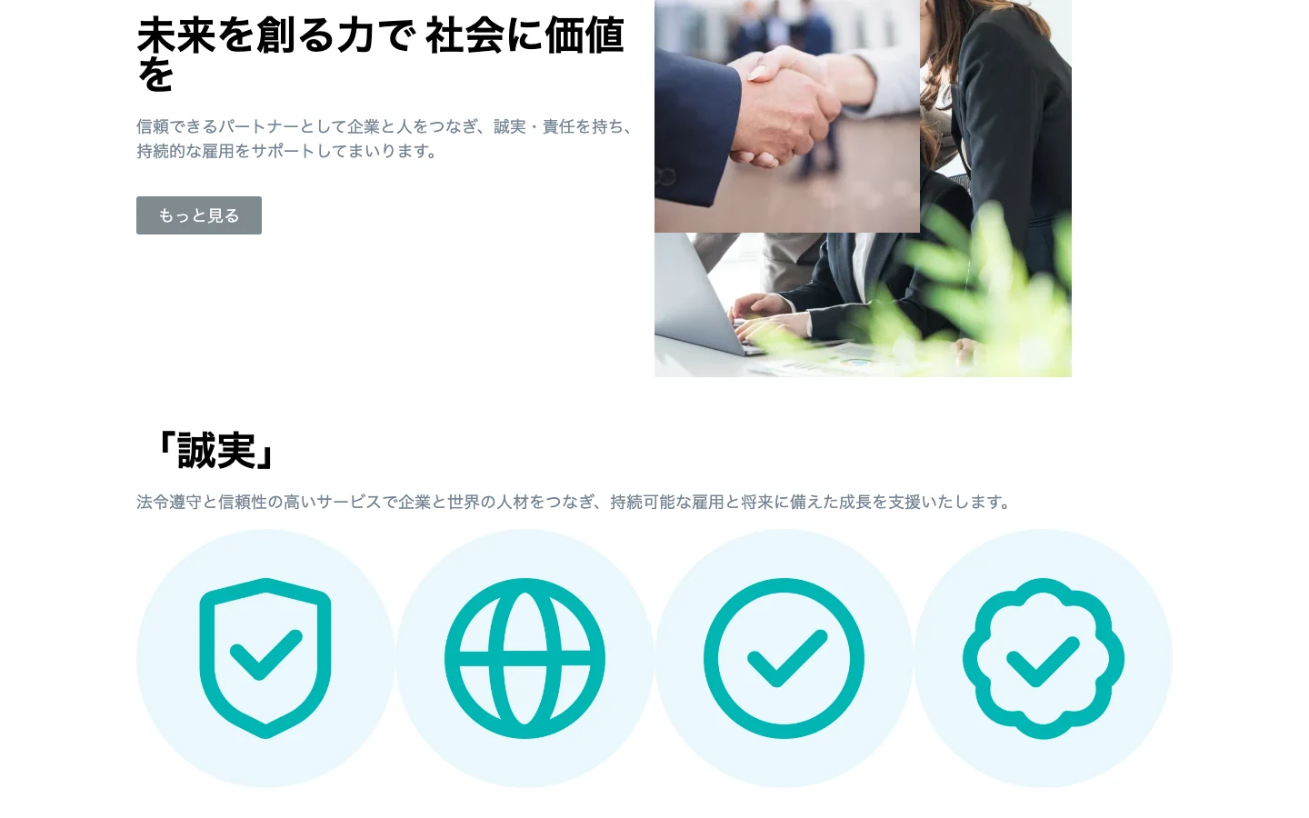
- The hero headline broke with one character, を, alone on its second line.
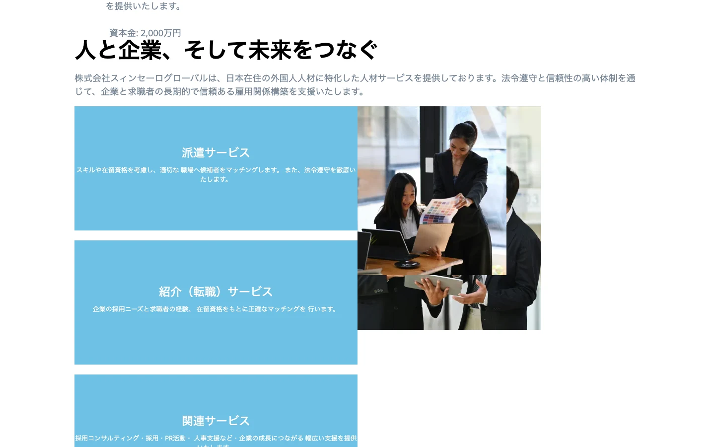
- Services sat in flat pale blue boxes with small white text, hard to read at any width.
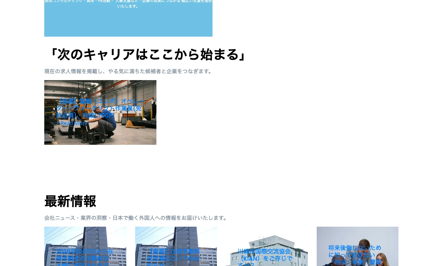
- Job and news titles were set in blue over photographs, where most of them could not be read.
- Stock photos of people in offices, for a company whose jobs are in factories, logistics and heavy machinery.
- Japanese and English lived on two domains, sinceroglobal2025.com and eng.sinceroglobal2025.com. The company’s own sinceroglobal.jp only forwarded.
- The Japanese page title was a machine translation, スィンセーロ グローバル – 接続したペルソナ (“connected persona”), and the page declared itself American English.
- No meta description, no Open Graph, no hreflang, no structured data.
Who it has to convince
Two readers. A hiring manager at a Japanese company looking for a licensed partner they can trust, and a foreign resident looking for work and help with a visa. Both need to feel the same thing: this company is serious, and it is on their side.
We kept what was theirs, the name and the green logo. Everything around them changed.
The new look
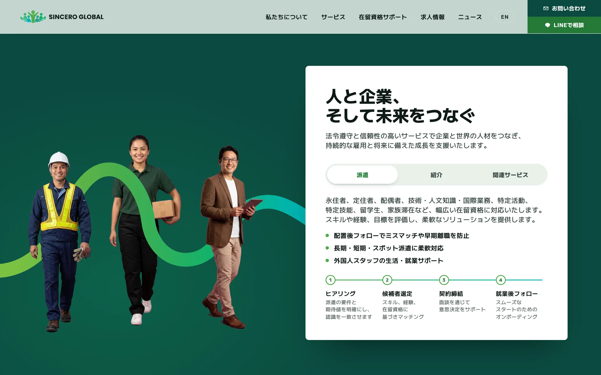
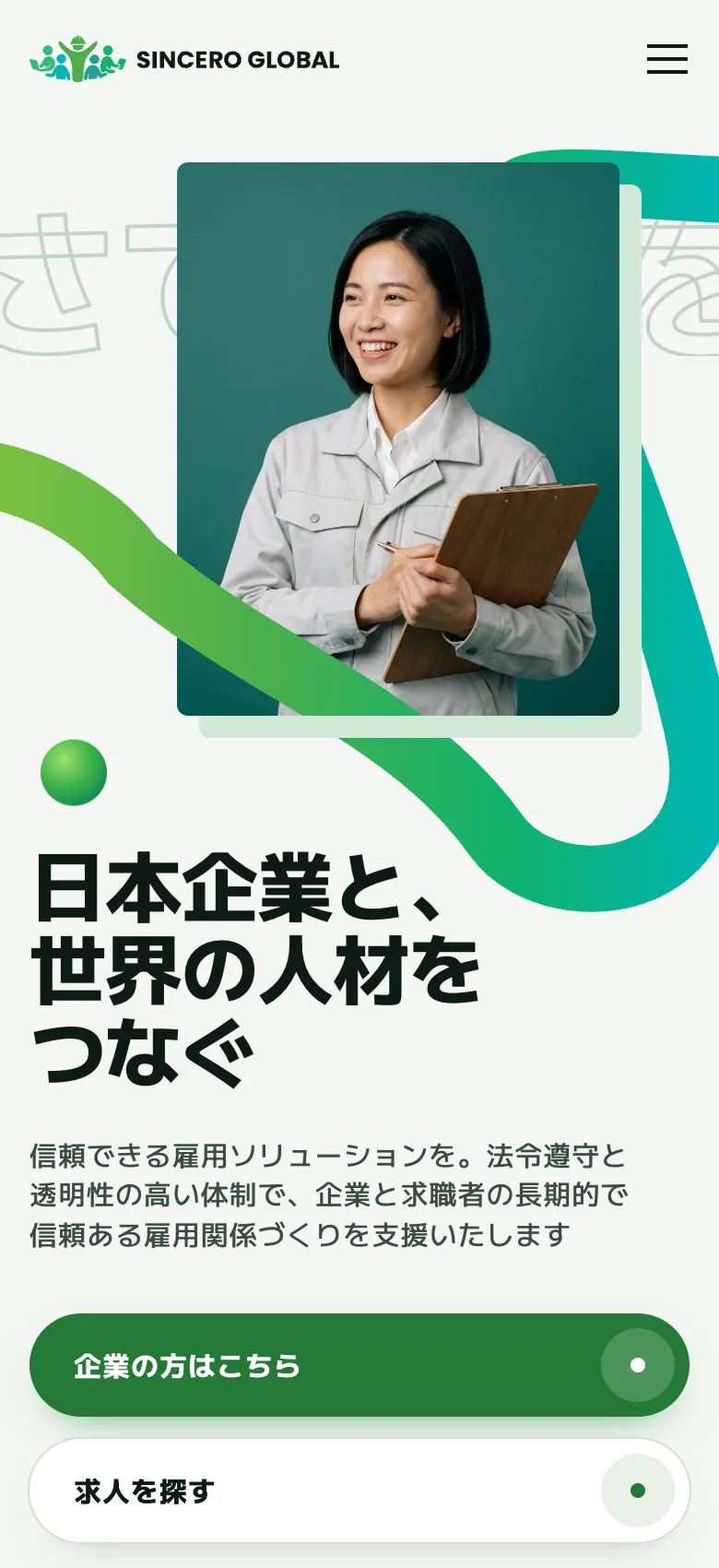
One idea carries the whole site. A ribbon in the logo’s green weaves through the page and connects people with companies, which is exactly what the company does. Heavy Japanese display type for the headlines, calm green and white grounds, and cutout portraits in work clothes instead of office stock.
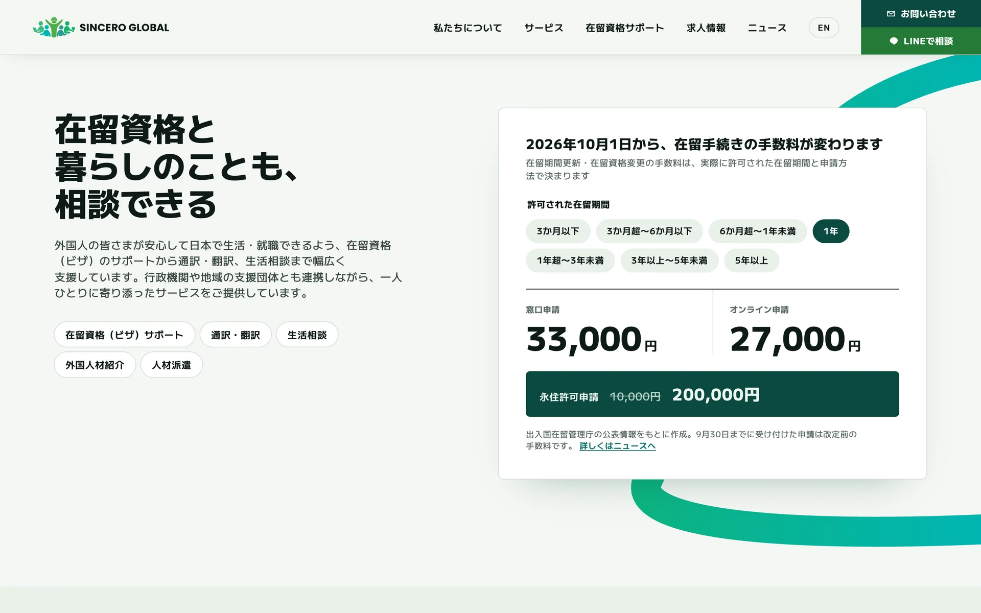
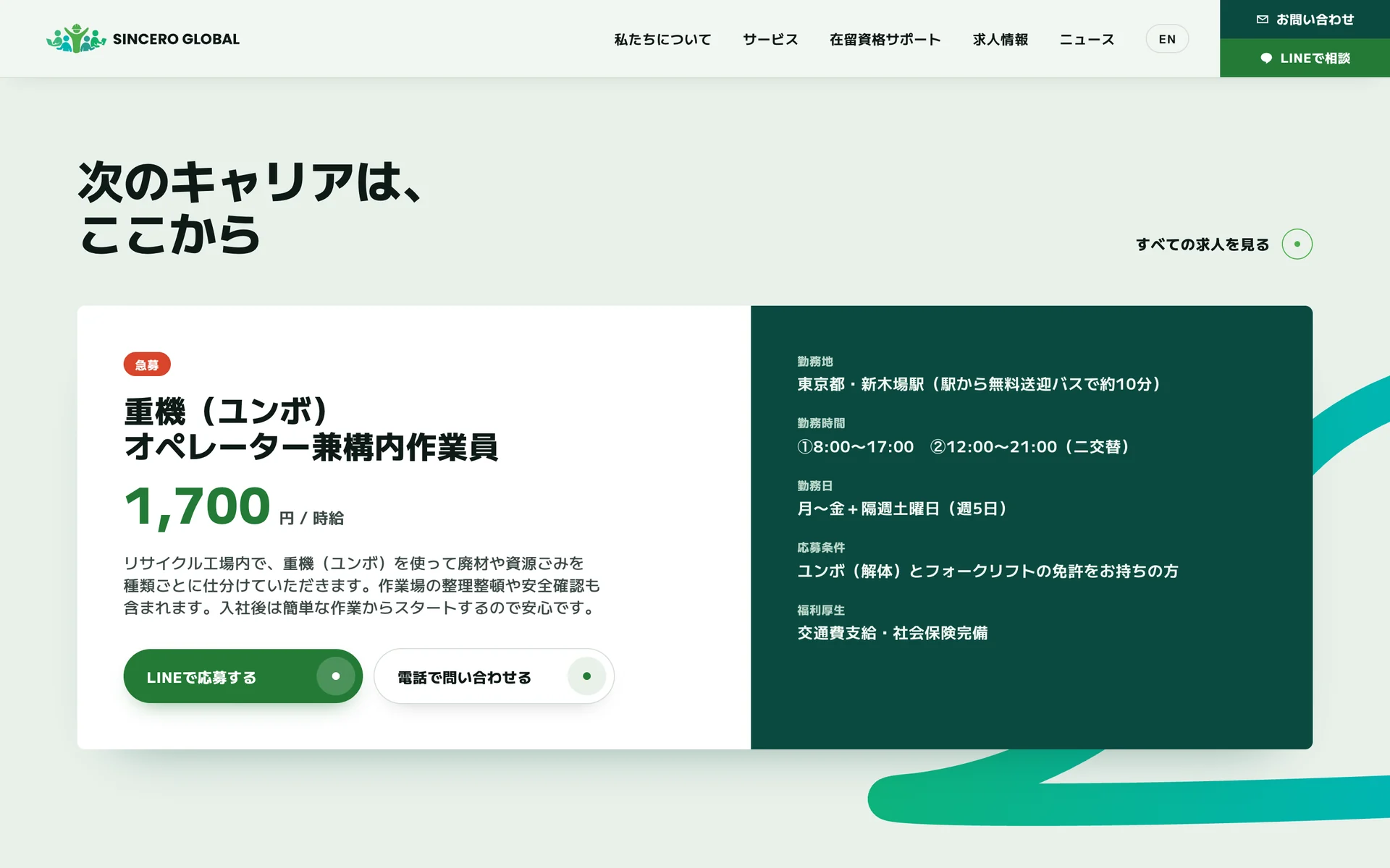
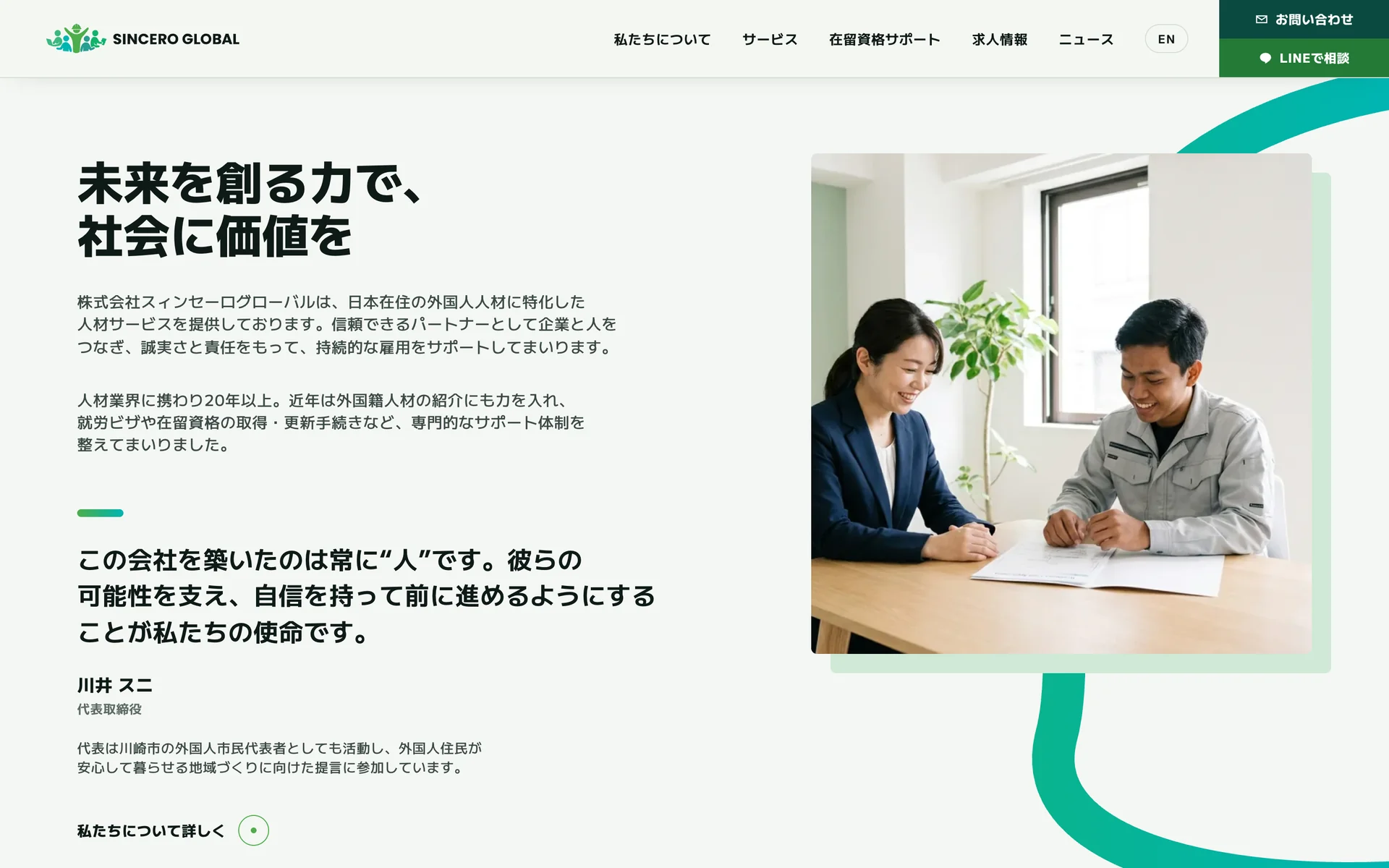
The page answers in the order people ask. Who they are. Why to trust them, with both license numbers and the capital right under the hero. What they do for companies and for workers. Visa support. Real job listings. News. Then three ways to reach them: phone, email and LINE.
The portraits are generated placeholders until a photo shoot, and the site marks them as samples.
One domain
Japanese at sinceroglobal.jp, English at /en/. Written as two pages rather than one translated after the fact, and linked to each other with hreflang. Structured data describes the company as an EmploymentAgency, with its address and contact details, so machines read it too.
Moving a domain means moving its email. Every mail record went across before the switch, so Google Workspace kept delivering to [email protected] the whole time.
How it was made
Four days from approved design to live on its own domain. Designed and built with Claude Code. We are a certified Claude Partner.
Before and after
| Before | After | |
|---|---|---|
| Look | WordPress template, stock photos | Its own identity around the green logo |
| Hero headline | Last character alone on a line | Breaks on Japanese phrases |
| Services | Small white text on pale blue | A tab and a process for each |
| Jobs and news | Blue text over photos | Listings with wage and conditions |
| Domains | Two, plus a .jp that only forwarded | sinceroglobal.jp and /en/ |
| Page title | 接続したペルソナ, machine translated | Company, service and city |
| Search and AI tags | None | Description, Open Graph, hreflang, JSON-LD |
| Contact | A form over a photo | Phone, email and LINE |
Before is a full page capture of the original WordPress homepage, saved before any changes. After is sinceroglobal.jp on 2026-09-29, desktop at 1440 × 900.
What a company in Japan can take from this
- A rebrand does not have to start with a new logo. Sincero kept its name and mark. What changed was everything around them.
- Pick one idea and let it do the work. Here it is a ribbon that literally connects people and companies.
- Your .jp domain is your brand. If it only forwards somewhere else, search engines and customers learn the other address.